
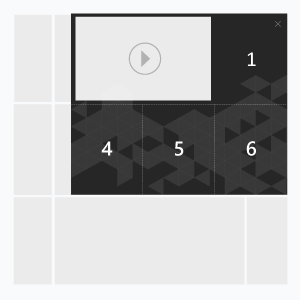
The ad format consists of 7 panels – 1 initial and 6 expanded. The same image can be used as the main panel and the 1st expanded panel. On click or mouseover, expanded panels appear flipping left and down one after another in the following order: Main panel-1-2-3(video)-4-5-6. On the Close button click expanded panels collapse in reversed order: 6-5-4-3(backup image instead of video)-2-1-Main panel. The ad may contain video in the 3rd panel overlaying also the 2nd panel depending on video size. As the 2nd panel may be covered by the video player, we recommend uploading the backup image in it. In case the banner doesn’t contain video, the video upload field (File3) in UI should be left empty and the image has to be uploaded. The user action – click or mouseover – is set from the user interface.
· autoplaying video ad with sound in auto-expanding banner.
Inventory Compatibility:
Local inventory (direct publisher zones) only.
Asset requirements
Main panel, WxH, px
300×250, 240×350 (standard size)
Expanded panels, including backup image (6), WxH, px
300× 250, 240×350 (standard size)
Video: WxH, px
- 300× 250/ 600×250, 240×350/480×350 (video player container size);
- in case the width and height of the video are not equal to the video player container size, the black space will appear on the sides of the video.
File type
- .jpg, .png, .gif
- .mp4 (video)
File size
- .jpg, .png – max 60Kb
- .mp4 – max 2.2Mb
- Total creative size is up to 3Mb
Controls (provided by the Platform)
- “× Close” button in the upper right corner of the expanded panel (allows user to close the expanded stage) is provided by default
- Audio Mute/Unmute button control – availability of buttons in the player is set from the user interface
- Video: Play/Pause button control – availability of buttons in the player is set from the user interface
Audio
User-initiated only (off by default)
Video
- Max video duration: 30 sec
- Frame rate: 24 fps
- Video is looped
Template Settings
The template settings are available in the UI.
Expand Direction
- Left — a banner expands to the left from the main panel
- Right — a banner expands to the right from the main panel
Expand Types
- Click — a banner expands after a click on it
- Mouse — a banner expands when the cursor is over it
Autoexpand
- Yes — a banner expands automatically when a page is loaded
- No — a banner is expanded by the user
Close Button
- Dark — the button will look like this

- Light — the button will look like this

File Upload
Main Panel
The main panel is an image that will show in an ad unit before expanding.
- Width — banner width; defined automatically on image loading
- Height — banner height; defined automatically on image loading
- Landing page — target URL the user go to after a click on a banner
Panel Image Upload
Files 1-2 and a video — the first line; files 4-6 — the second line according to the scheme above.
- Images
- Width — banner width; defined automatically on image loading
- Height — banner height; defined automatically on image loading
- Landing page — target URL the user go to after a click on a banner
- Video
- Local — video will be uploaded to a server from the user’s computer
- Autoplay:
- Yes — video plays automatically
- No — video is started by the user
- Video Loop:
- Yes — when a video ends, it will play again
- No — a video will stop after it ends
- Width — video player width
- Height — video player height
- Landing page — target URL the user go to after a click on a banner
Event tracking
- View
- Confirmed view
- Click
- Expand by user
- Collapse by user
- Play
- Pause
- Sound on
- Sound off
- Progress (firstQuartile, midpoint, thirdQuartile, complete)
– Uses the main thread for more than 60 seconds in total
– Uses the main thread for more than 15 seconds in any 30-second window
– Uses more than 4 megabytes of network bandwidth